
Universal Theme Secrets: Advanced Customization in Oracle APEX
Beyond the Theme Roller: How to Build Premium, Maintainable UIs

Lee este APEX Insight en Español.
The Problem: When Theme Roller Isn't Enough
The Oracle APEX Universal Theme provides an incredible foundation. With Theme Roller, teams can quickly brand applications with corporate colors and logos. But what happens when the design requirements demand more? When the UI needs to break out of the standard grid, or when a generic button style doesn't fit the premium aesthetic requested by stakeholders?
Many developers resort to injecting scattered CSS directly into page properties or scattering <style> tags across regions.
This approach creates a severe technical debt trap: Unmaintainable UX.

In this APEX Insights entry, we explore the architectural root cause of messy customizations and provide an optimized solution to styling APEX applications like a frontend professional.
The Architectural Root Cause: Bypassing the Cascade
The Universal Theme is built on a robust CSS architecture. When developers inject inline styles or dump massive CSS overrides into the Page Inline CSS attribute, they are bypassing CSS hierarchy and specificity rules.
This leads to:
Broken Upgrades: When APEX receives a patch or the Universal Theme is updated, brute-force CSS overrides often break the layout.
Performance Hits: Heavy, unminified inline styles negatively impact render times.
Inconsistent UI: Buttons on Page 1 look different from those on Page 15 because the styles aren't centralized.
The Optimized Solution: A Professional Frontend Workflow in APEX
To build a premium, maintainable UI, we must treat APEX styling as a true frontend engineering task.
1. Centralize the Design System in Static Workspace Files
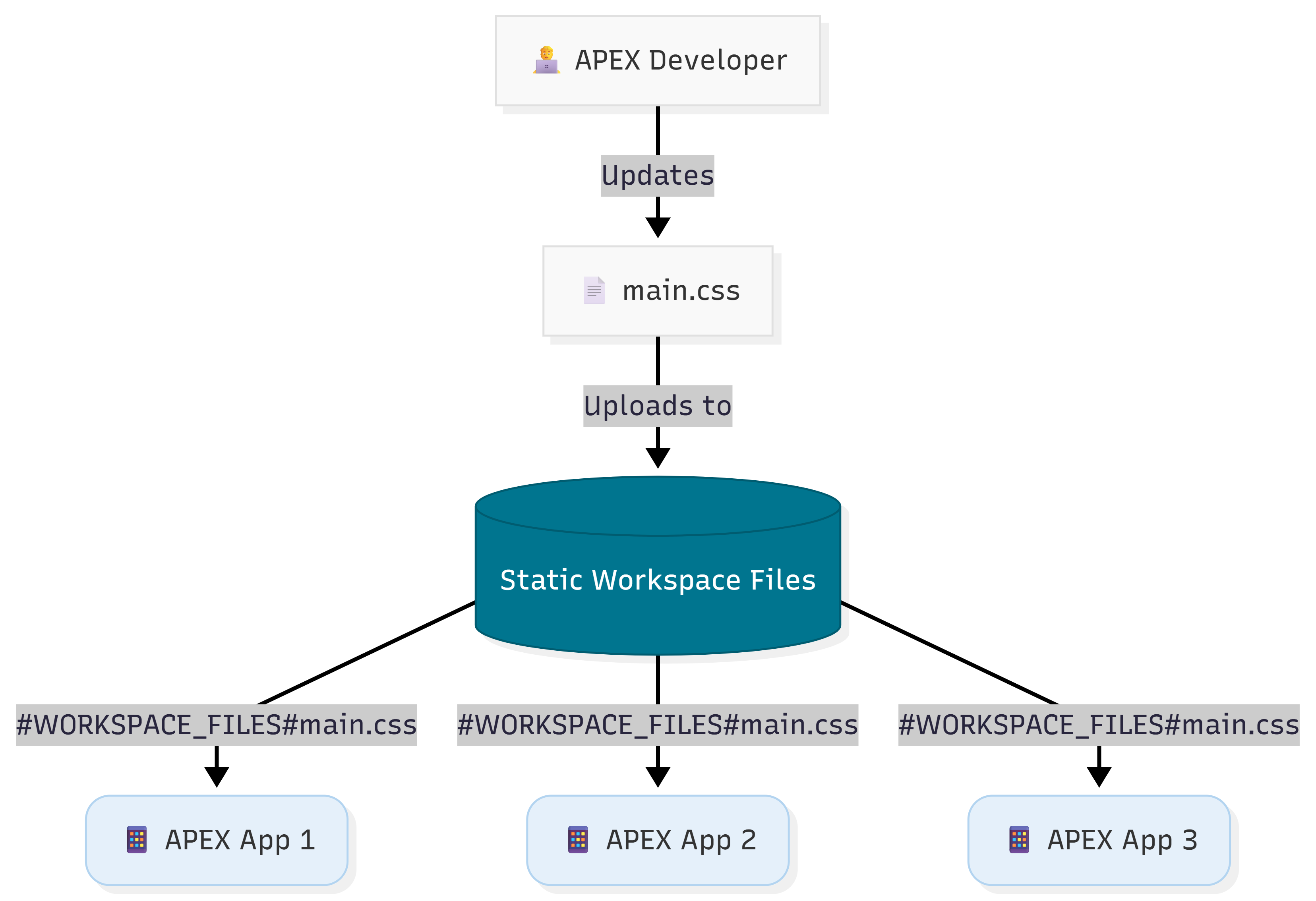
Stop placing CSS in the Page Designer. Instead, consolidate all custom styles into a single, version-controlled CSS file (e.g., main.css) and upload it to Workspace Static Files.
/* Example: main.css */
/* Premium Glassmorphism Card Override */
.custom-glass-card {
    background: rgba(255, 255, 255, 0.1);
    backdrop-filter: blur(10px);
    border: 1px solid rgba(255, 255, 255, 0.2);
    border-radius: 12px;
    box-shadow: 0 4px 6px rgba(0, 0, 0, 0.1);
}
Reference this file at the Application Level (User Interface Details -> CSS) using #WORKSPACE_FILES#main.css. This ensures that updating a button style globally requires only one change in one file.
2. Custom CSS in Theme Roller vs. Workspace Files
A common misconception is that all custom CSS should be pasted into the Custom CSS section of the Theme Roller.
While the Theme Roller is excellent for quick prototyping and live previews, it lacks professional features:
No Version Control: You cannot track UI changes via Git.
No Modularization: It often leads to a single, monolithic, hard-to-read block of CSS.
Collaboration Issues: Multiple developers working on the UI might overwrite each other's changes.
Best Practice: Use Theme Roller's Custom CSS for temporary tests. Once a design is approved, migrate that CSS into your main.css file and commit it to your repository.
3. Leverage CSS Variables (Custom Properties)
The Universal Theme relies heavily on CSS variables (e.g., --ut-palette-primary). We can harness these, or define our own, to ensure dark mode compatibility out of the box.
Here are a few essential Universal Theme variables every APEX developer should know:
--ut-body-background-color: The main background.--ut-component-text-color: Essential for readable text against light/dark themes.--ut-component-border-color: Perfect for subtle outlines and dividers.--ut-component-box-shadow: For consistent, native elevation.
Instead of hardcoding colors:
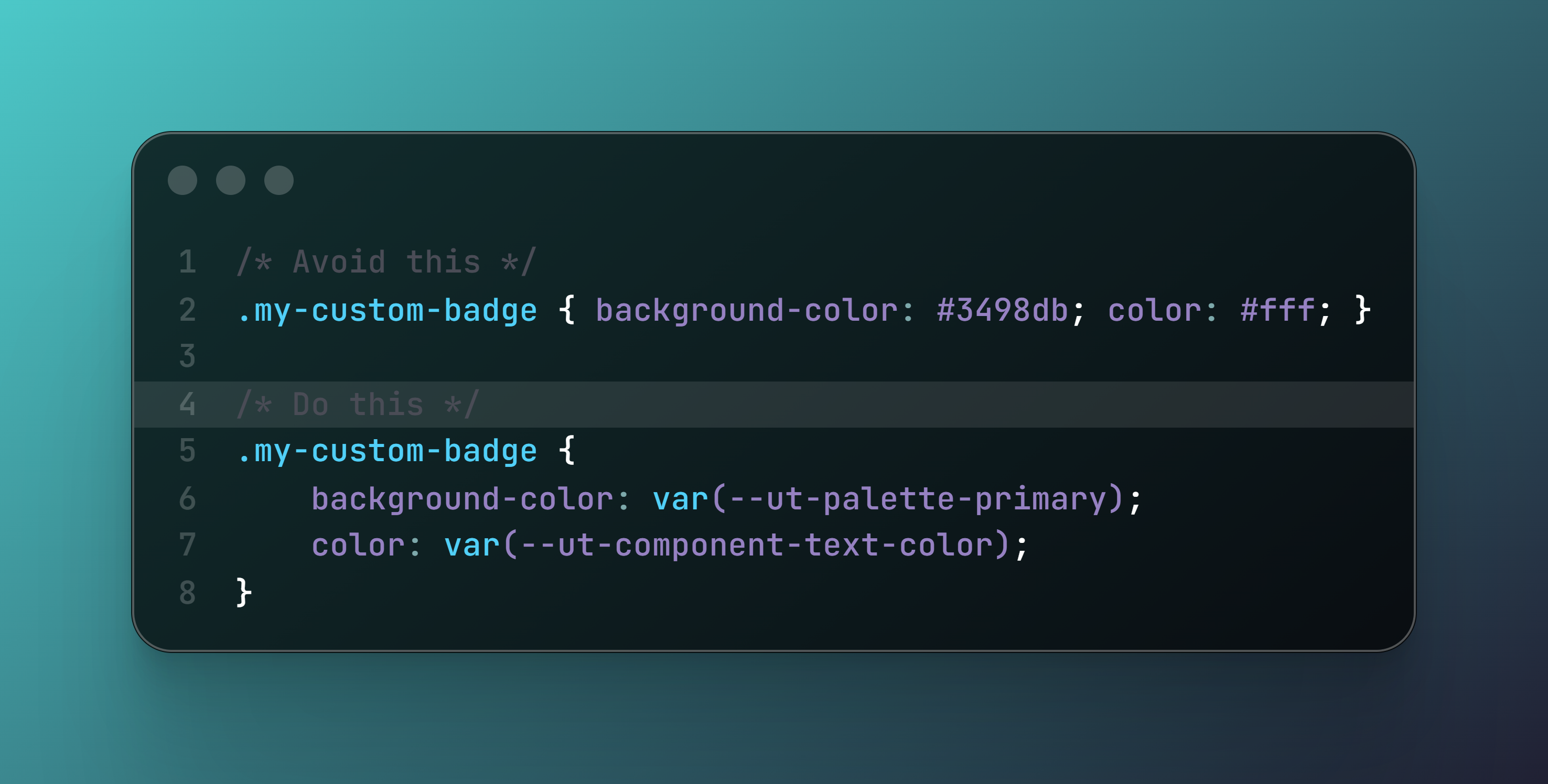
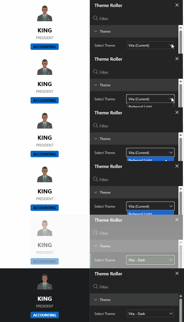
By mapping our custom classes to existing --ut-* variables, our custom UI components will seamlessly transition when the user switches to Dark Mode via the Theme Roller.
4. Extend APEX with Custom Template Options
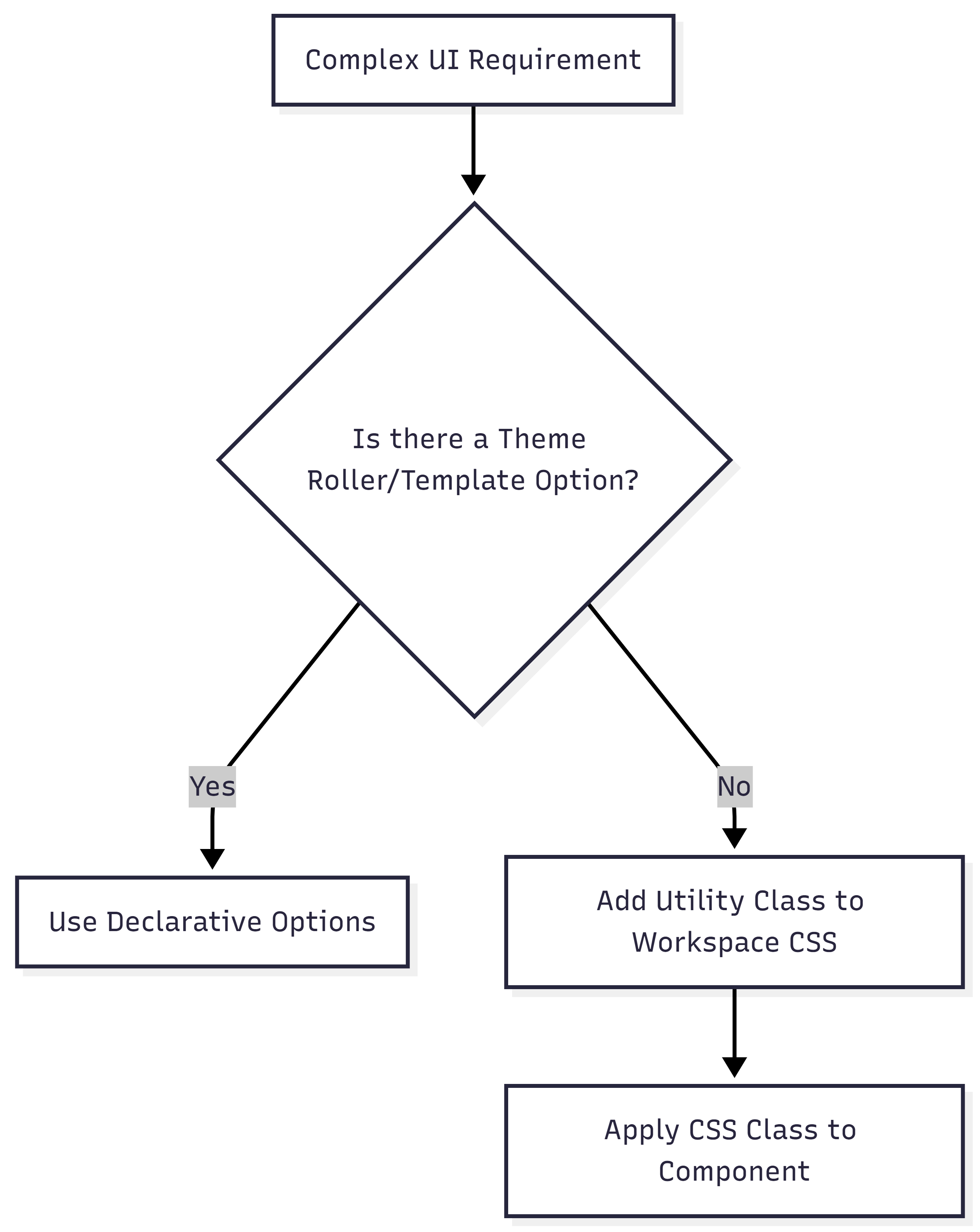
When you need a specific region to have no padding and a subtle shadow, don't write CSS in the page. Use the declarative Template Options provided by the Universal Theme.
If the exact aesthetic isn't available, you can extend the APEX declarative engine! Create a utility class in your centralized main.css and then register it as a Custom Template Option:
Go to Shared Components > Templates.
Select the Region or Button template you want to extend.
Scroll down to Template Options and click Add.
Name it (e.g., "Premium Glass Card") and map it to your new CSS class (
.custom-glass-card).
Now, any developer on your team can apply your CSS class declaratively from the Page Designer, without ever touching CSS!
Transforming APEX Apps into Premium Experiences
Adopting a centralized, variable-driven CSS approach transforms an APEX application from a basic internal tool into an enterprise-grade product.
🟢 Maintainability: Upgrading APEX versions becomes safer because styles are isolated and leverage core variables.
🟢 Performance: Static files are cached by the browser, reducing the payload of every page load.
🟢 Consistency: A unified design language ensures every screen feels like part of the same premium suite.
https://gist.github.com/aguilavajz/3526340c94b245e724cdd5fff435075d
🎁 Download the "APEX UI Best Practices Checklist (PDF)". Ensure your next project follows the optimal styling approach. 📥 Download PDF Checklist
How do you manage custom CSS in your APEX environments? Share your scaling strategies with us!
🚀 Take the Next Step
Review our previous entry on Performance Tuning in Interactive Reports.
Read the Docs: Check the Universal Theme Reference.
Connect with the community: Join the conversation on LinkedIn.
☕ Schedule a Call
💼 Connect on LinkedIn
🐦 Follow on X


